HOME
CODE CAMP BLOG
$1 COACHING
JOIN THE CODE ZONE COMMUNITY
CONTACT US
Sign up
Login
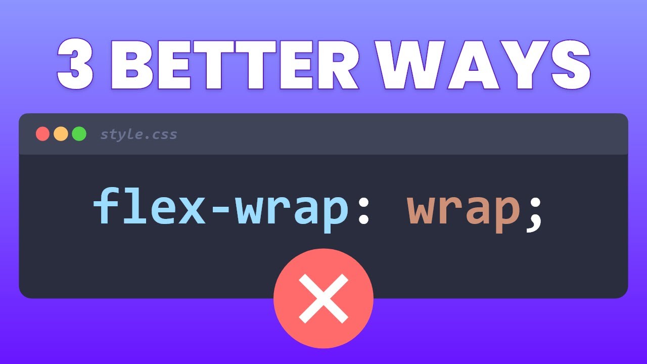
Exploring Alternatives to Flex Wrap in CSS
1. Understanding the Limitations of Flex Wrap
2. Alternative Solutions to Flex Wrap
3. Solution 1: Responsive Media Queries for Card Layouts
4. Solution 2: Horizontal Scrolling for Multiple Cards
5. Solution 3: Leveraging CSS Grid for Large-Scale Layouts
6. Conclusion
7. FAQs
Exploring Alternatives to Flex Wrap in CSS
4 minute read
Related Posts
Massive Library of SVG Icons for Vibe Coding Projects
Master CSS ::before and ::after Pseudo-elements for Stunning Styles
Add Web Animations in 5 Minutes with Animate.css
Revolutionizing Web Design with New CSS Features
CSS Tutorial: Creating a Search Input Field with Button Effects